
Nester is a groundbreaking Peer-to-Peer (P2P) investment platform, redefining the way individuals engage with their financial futures. This project encapsulates the journey of conceiving, designing, and developing the Nester app – an innovative platform that bridges the gap between investors and opportunities.


I employ a holistic approach, aiming to integrating empathetic research, iterative prototyping, and constant user feedback to craft intuitive and meaningful digital experiences.
In-depth user interviews, competitor analysis's, user testing and data analysis.
This is where I begin to understand my users by creating personas and starting to flesh out potential user flows and user journeys.
Very low level development begins aided by exercises such as card sorting, creating site maps & finally developing some low level wireframes
Development of wireframes to mid and high fidelity prototypes. Iterations take place by testing at various steps throughout the process refining the design.
I researched websites and applications within the same industry, seeking parallels in features and design aesthetics. I also decided to delve deeper by requesting the Nester team provide me with a list of websites they liked (didn’t have to be finance related), along with the specific features they admired.
When looking at competitors' platforms, I took particular interest in the navigation of crucial features such as account management, investment options, and support services. I conducted an in-depth analysis of the onboarding experience, examining how users are guided through the platform's key features. Additionally, I assessed the transparency in presenting information about investment opportunities, aiming to gauge the clarity and completeness of the provided data.
A crucial aspect of the analysis involved scrutinising the simplicity and efficiency of setting up and managing investment portfolios. By delving into these details, I was able to gain a comprehensive understanding of the competitive landscape, providing valuable insights for refining and enhancing the user experience on the Nester platform.

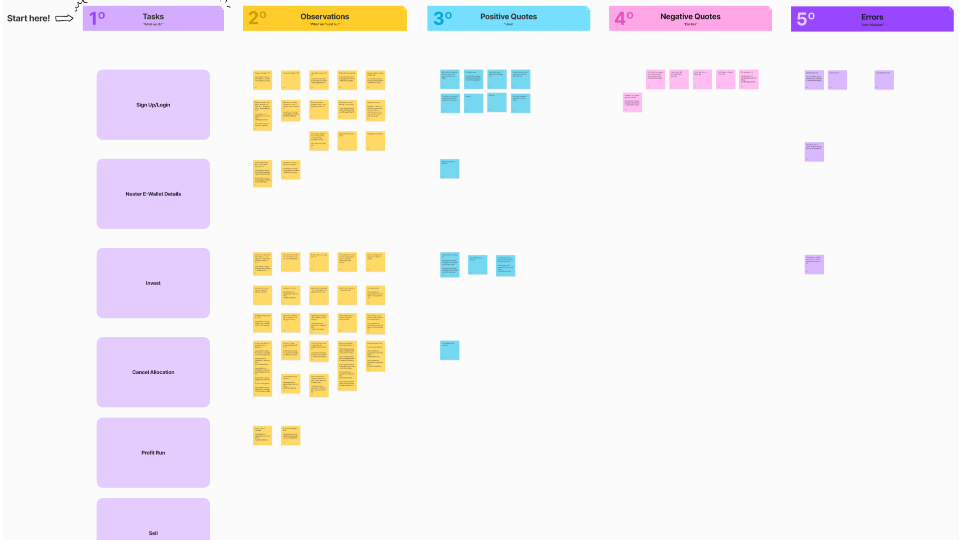
Once we had compiled all the relevant websites and conducted extensive research, it was important to conduct a thorough ux examination of the current Nester investor web platform. I decided to interview five individuals (2 current users of Nester and 3 completely fresh participants) who were all familiar with or had an interest in investing. I created an interview script drawing on our background research including personal anecdotes we found online, news on the P2P investing space, similar investing apps, advice from my business stakeholders, and other finance resources. I then arranged 45-minute interviews with the participants on the interview platform Lookback. I transcribed the interviews to find patterns in their answers and brought this back to the team and collated into themes via an affinity mapping exercise (see right).

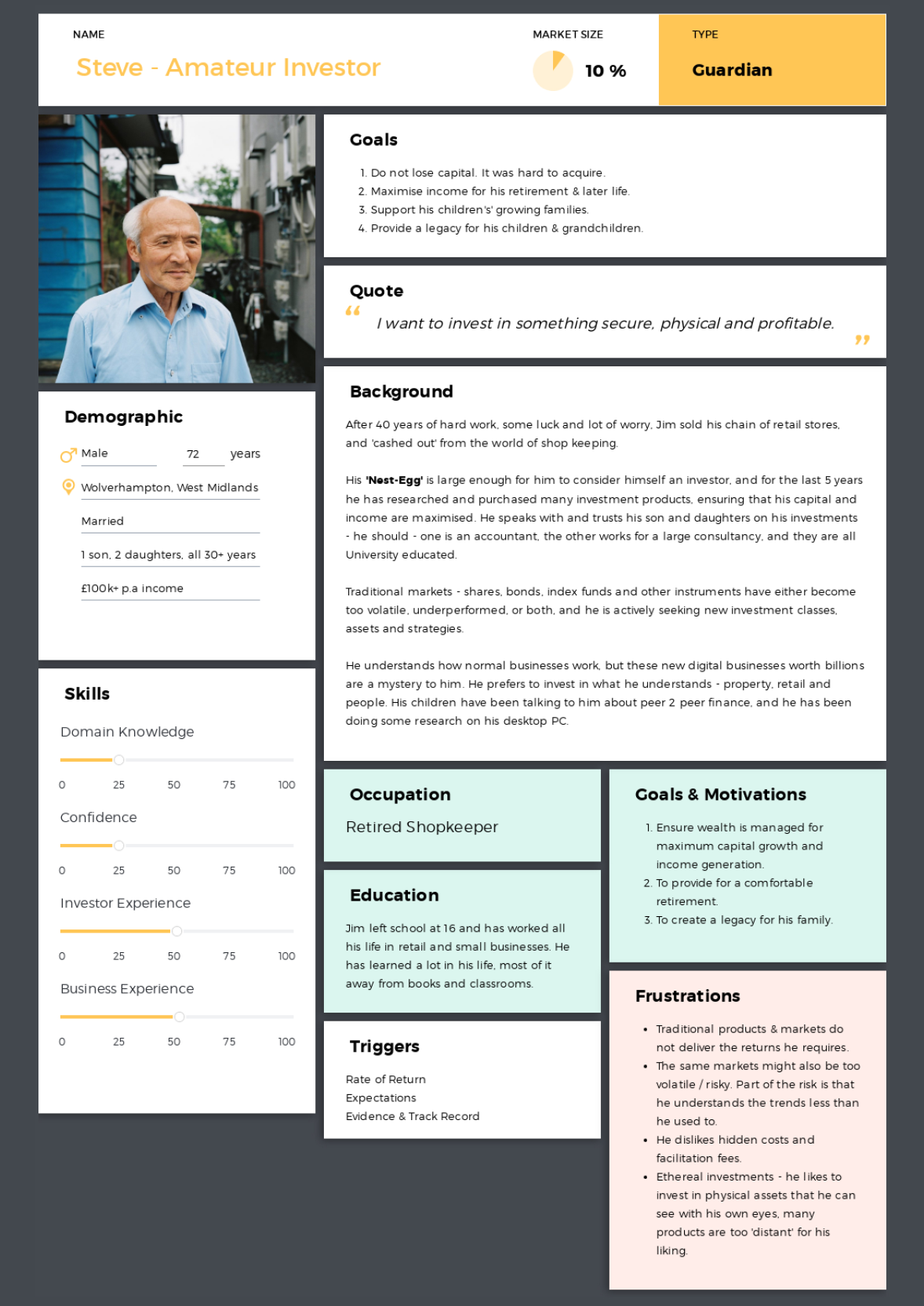
From my background research and primary qualitative user research insights, I made two user personas to represent the users who may find our application useful. Through our research we found several user needs including seeking reliable financial information, clear investing process and a need for a variety of investment opportunities. Patterns in lifestyle constraints and personality types were included as context to help the whole team empathise with our end users and keep the user at the core of our designs.

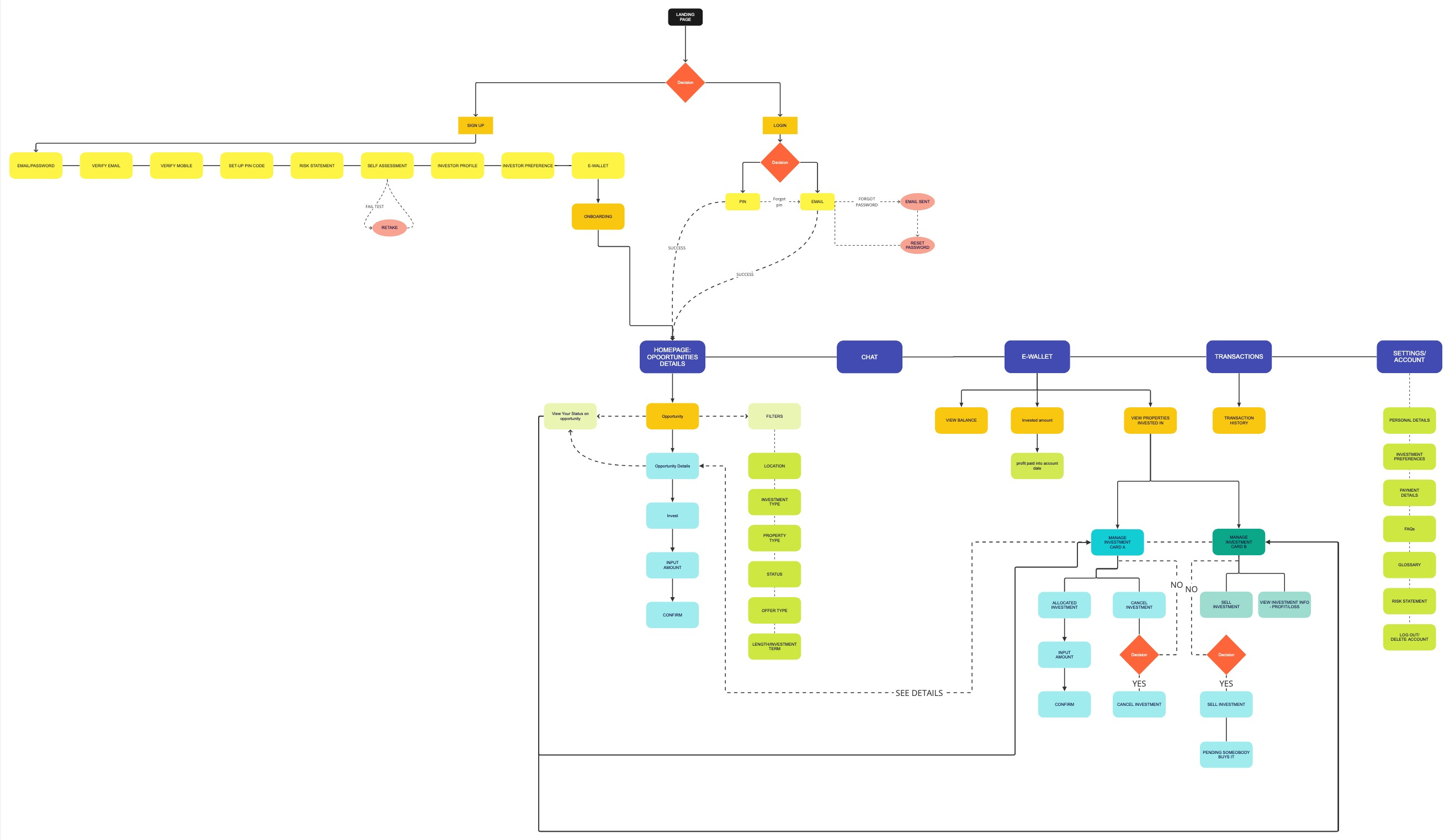
Conducting a user survey proved to be an instrumental phase in shaping the information architecture of the app. The insights gleaned from this survey provided a comprehensive mental model of our users, enabling me to identify valuable user behaviours to understand their expectations and assumptions to allow for a more tailored design approach that aligns with users' needs and preferences. I used Optimal Sort to conduct my User survey.

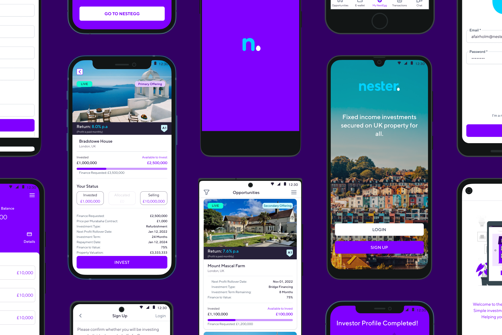
I emphasised creating a streamlined user journey for effortless navigation of the account dashboard, available investment opportunities, and portfolio management.
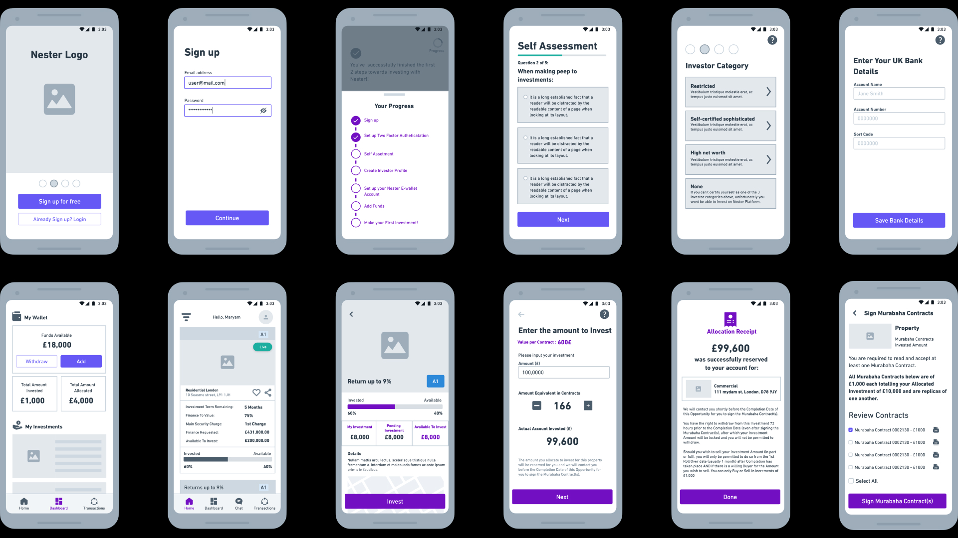
Considerations included adherence to FCA regulations and compliance with Sharia financing laws for an Islamic financing platform. As highlighted in the user research, the onboarding and registration was something that needed to be looked at with the aim to provide less cognitive load for a more streamlined user experience. The investment process involves intricate user flows, encompassing aspects such as understanding the investment opportunity, Murabaha contract pricing, and signing the contract post-allocation. Displaying essential information, such as the live Murabaha contract value and available investment amount, required careful consideration.
Collaborating with Nester engineers, we addressed the UX intricacies of the investing process, incorporating a clear portfolio section. This section enables users to seamlessly toggle between different stages of their investments, providing a concise overview of their current investment status.
With guidance from the business, I began experimenting with different layouts to determine what would work best for the app. We ultimately opted for a minimal approach, recognising the pivotal role of displaying investment details in a user-friendly format. Given the complexity of the investment process, the aim was to simplify portfolio management.
I curated innovative navigation solutions, notably introducing a 'progress stepper' to distinctly outline the user's tasks, whether it be onboarding or investing in an opportunity.
Through iterative processes and thoughtful discussions, I identified design elements that met both user needs and business objectives, that allowed me to take that further to build higher fidelity designs.

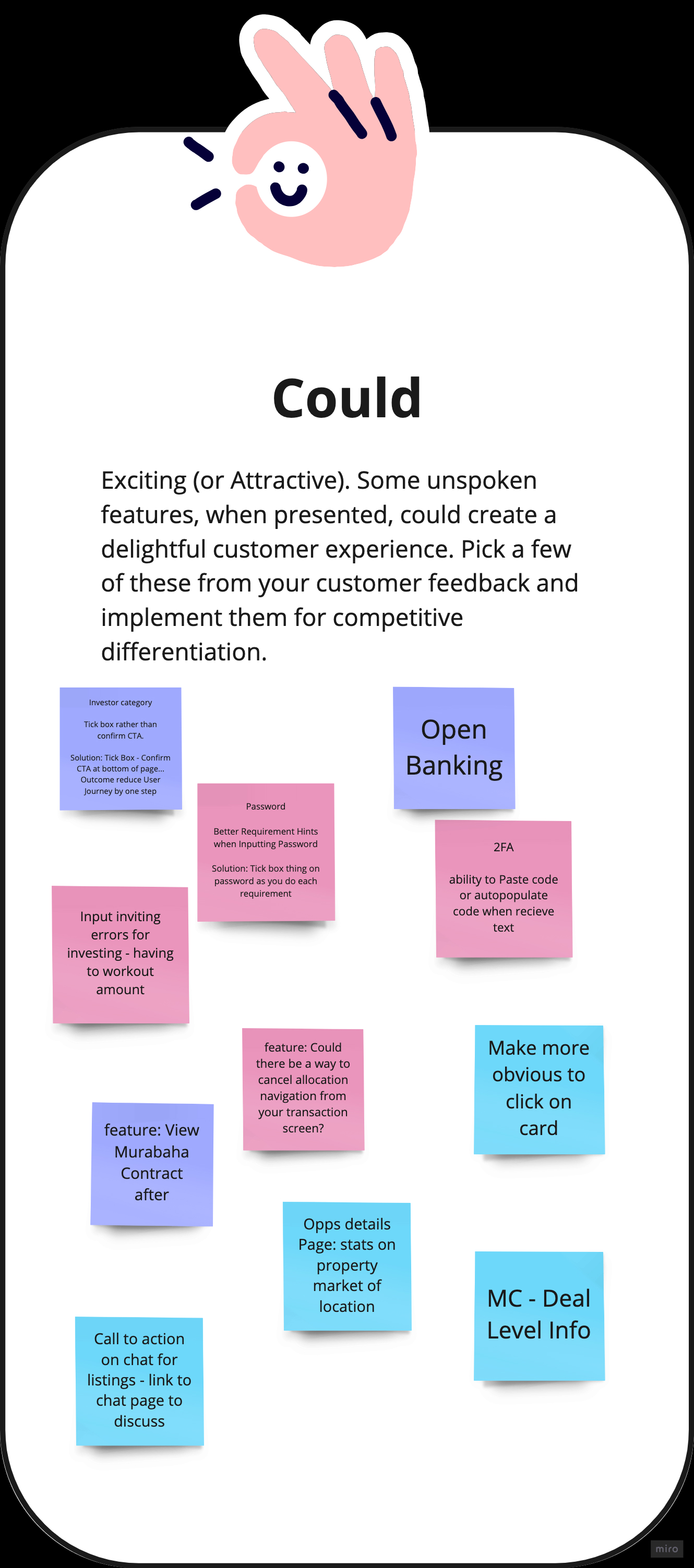
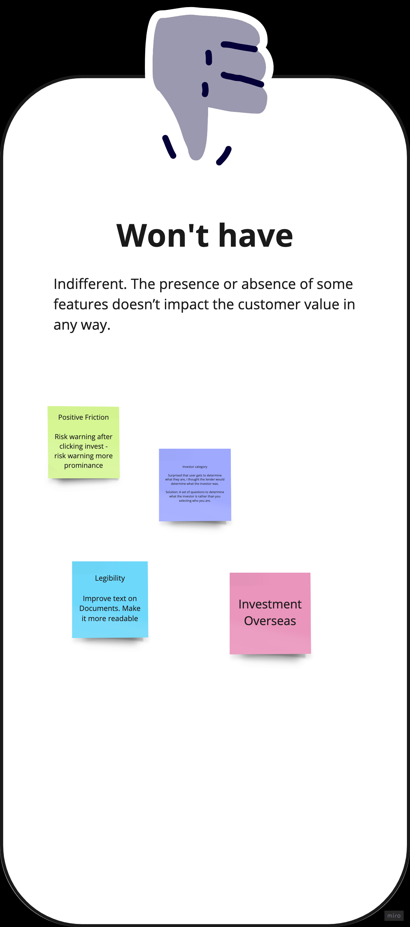
In order to evaluate the usability of the app, we conducted user testing with a sample of 10 users. Each session lasting 45 minutes. It was structured around five key tasks: signing up, completing the onboarding/registration process, making an investment, canceling investment allocation, and selling an investment. The objective was to comprehensively assess the user experience and identify areas for improvement.
Following the user testing sessions, we employed the MoSCoW method as a prioritisation technique to analyse the observations and insights gathered. The MoSCoW method proved particularly effective in aligning stakeholder expectations and determining the priority of features for the app. we gained clarity in our design strategy. It allowed us to prioritise enhancements based on the observed user behaviours, ensuring that the focus remained on addressing key features that contribute significantly to the app's usability. This iterative process, combining user testing and the MoSCoW method, has proven instrumental in refining the design approach and creating a product that aligns more closely with user expectations and preferences.
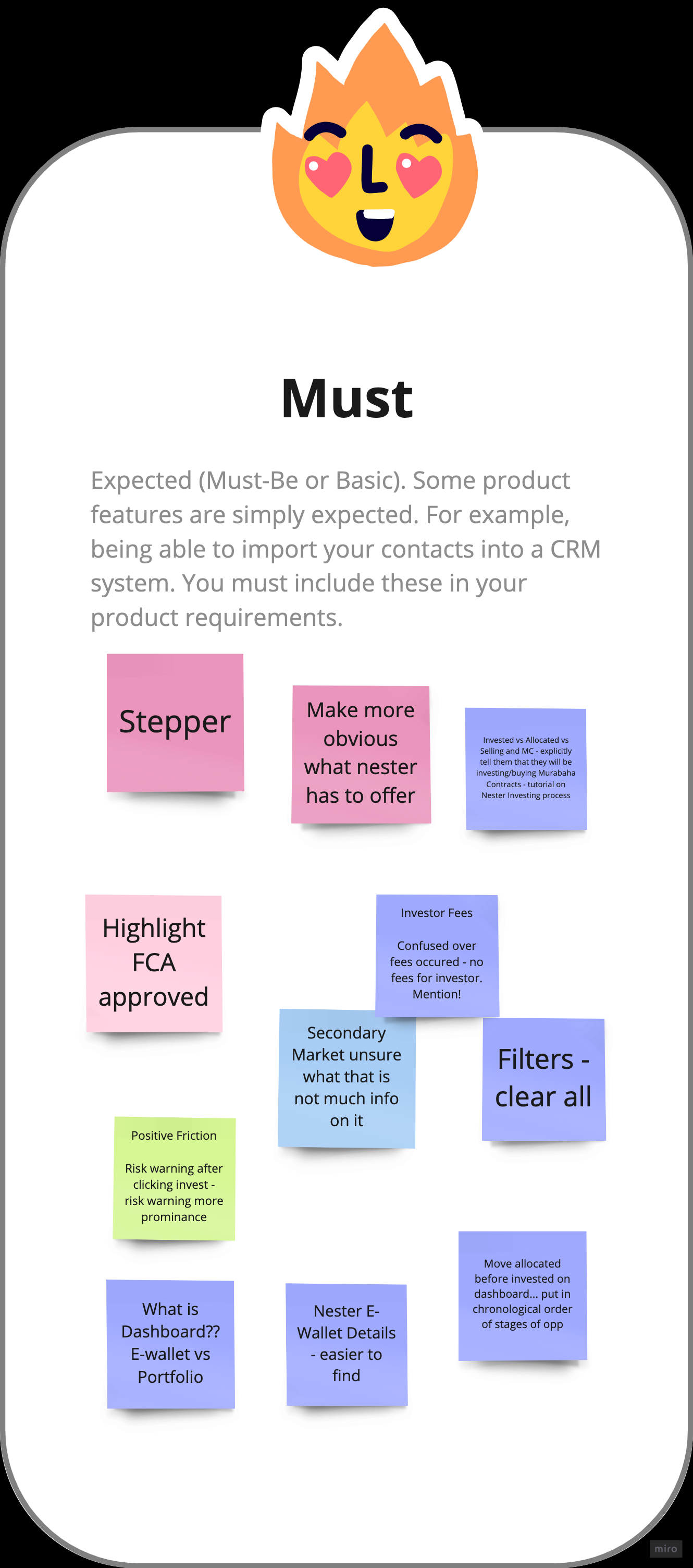

Following user testing, overall the feedback was really positive. As this app is aimed at a wide variety of users both in age and in investment experience it was amazing to see different types of users interacting with the app.
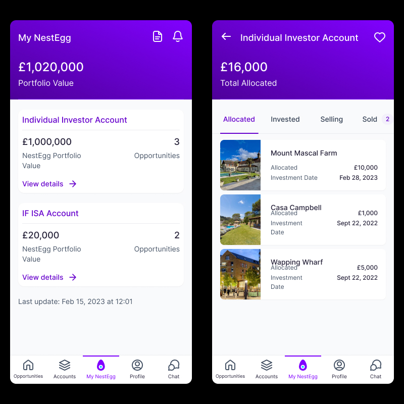
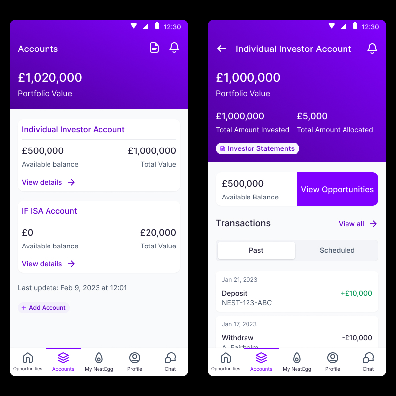
However there were some key issues that got highlighted with the app, it became evident that the initial dashboard design lacked optimisation for mobile devices. In response, I devised a refined solution by segregating the e-wallet and portfolio into distinct options within the main navigation bar. The revamped 'dashboard' screen now serves as the user's e-wallet, offering swift access to vital information and facilitating actions such as withdrawals and account top-ups. Additionally, a new section titled "My NestEgg" is dedicated to portfolio management, establishing a clear hierarchy for the various stages of invested opportunities. This iteration aims to enhance the overall user experience based on insights gained from the high-fidelity prototype testing.

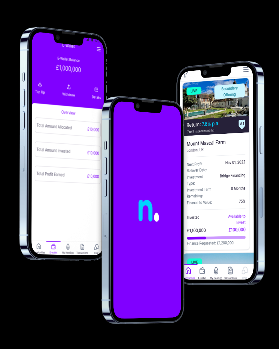
Combined E-wallet & Portfolio

Seperate E-wallet to manage your finances, withdraw and top up your account
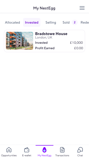
Seperate portfolio screen to manage your invested opportunities.
Following the definition and implementation of MVP technical requirements, I proceeded to conceptualise and implement the necessary functionality and design elements to align with upcoming specifications. This included considerations for future Nester features and products, including the introduction of an IF-ISA product (which has been newly released to the Nester platform). Embracing an iterative design approach, our methodology revolves around a dynamic and cyclical process, emphasising ongoing refinement of design solutions. This flexibility enables swift adaptations based on user feedback and evolving project requirements.
Outlined below are examples of upcoming iterations that the Nester team is poised to implement within the future product roadmap. Which includes an improved UI as well as new product features, some of which are already available on the investor web platform.

Reaction to the app has been overall really positive, reflecting on the project, there remains room for ongoing refinement, but I am proud of our achievement in delivering a functional product that successfully addressed key business and user objectives. The user testing and redesign phase proved particularly compelling, marking a significant advancement for the app. By exposing our prototype to users, we gained valuable insights into areas for improvement, identified strengths, and executed crucial changes, such as separating the e-wallet and Portfolio into distinct screens. This process deepened our understanding of user interactions, and helped to shape our product roadmap to align more effectievly with both business and user goals.
"Alex joined the team and was able to take complex technical concepts and distill them down to the core value propositions and conceived and designed a compelling app which will help us stand out among the competition and one which will contribute to Nester’s growth."


