The world of buying and selling has changed—more and more transactions happen online without the need for a physical credit or debit card. The amount of online sales and transactions is and has been steadily increasing, consumers are subscribing to a multitude of online services, and high street stores are closing in large numbers. PlutoPay helps people manage their finances when they lack confidence or feel they are inadequate in making financial decisions.
I employ a holistic approach, aiming to integrating empathetic research, iterative prototyping, and constant user feedback to craft intuitive and meaningful digital experiences.
Identify target demographic & potential competitors by performing a SWOT analysis, creating surveys & conducting interviews
This is where I begin to understand my users by creating personas and starting to flesh out potential user flows and user journeys.
Very low level development begins aided by exercises such as card sorting, creating site maps & finally developing some low level wireframes
Development of wireframes to mid and high fidelity prototypes. Iterations take place by testing at various steps throughout the process refining the design.
Getting to know the key competitors in the market helped me to get an idea of what users might expect from my web app. It allowed me to see which of my competitors are doing a good job at solving user problems (and which aren’t), and opportunities to meet an unfulfilled user need.
An explosion of new consumer finance brands is transforming how people save, spend, and manage their money. Companies are making it easier to make a budget, invest, and buy stocks, as well as to get loans and credit cards. Personal financial management tools need to overcome a user’s natural reluctance to allow an app to tap into their financial data. They need to show their users how helpful they can be during the first-run experience while asking them to commit to them personal and financial data.

I was able to use the initial insights from the Competitive Analysis and the User Survey to help me plan for and script my user interviews. This user-centered approach ensures valuable insights into the needs, preferences, and behaviors of the target audience and I was able to better understand my design problem.
User Interview Script


All respondents would like to have one place where they can manage all their accounts with total control and functionality
The app must be able to satisfy the users goals without overloading them with information or be difficult to navigate.
Users visit a platform with specific goals in mind. Allow users to efficiently accomplish their tasks.
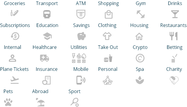
Clearly defined Transaction history with well labelled and accurate categories to provide financial analysis of spending habits
Budgeting tools and forecasting to help save money and allow people to manage their moneybetter
Payments/Transactions; being able to edit/change/cancel them easily
Eases of use and accessibility is key. Users must be able to access and manage their finances whilst on the go
People would prefer to have a mobile app where they can manage their finances rather than doing it on a web browser or ontheir laptop
From my background research and primary qualitative user research insights, I made two user personas to represent the users who may find our application useful. Through our research we found several user needs including seeking reliable financial information, clear investing process and a need for a variety of investment opportunities. Patterns in lifestyle constraints and personality types were included as context to help the whole team empathise with our end users and keep the user at the core of our designs.

.jpg)
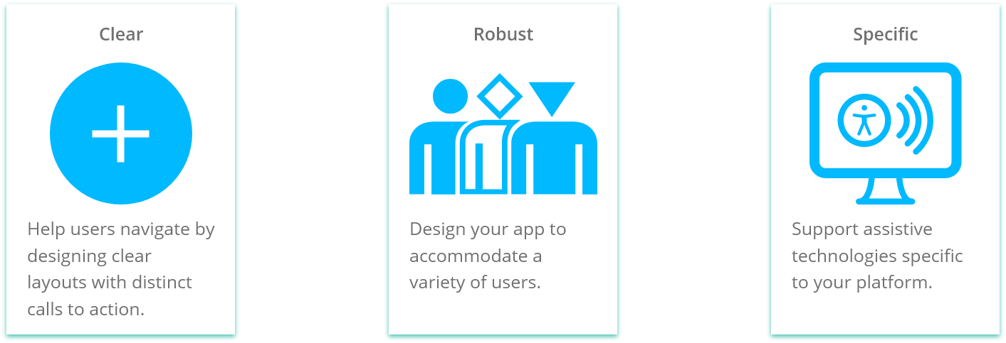
Open Banking connects all bank accounts in one place
Ability to quickly and effective manage your accounts
Simple budgeting and savings information at your finger tips
Digestible analysis easy for users to understand and comprehend
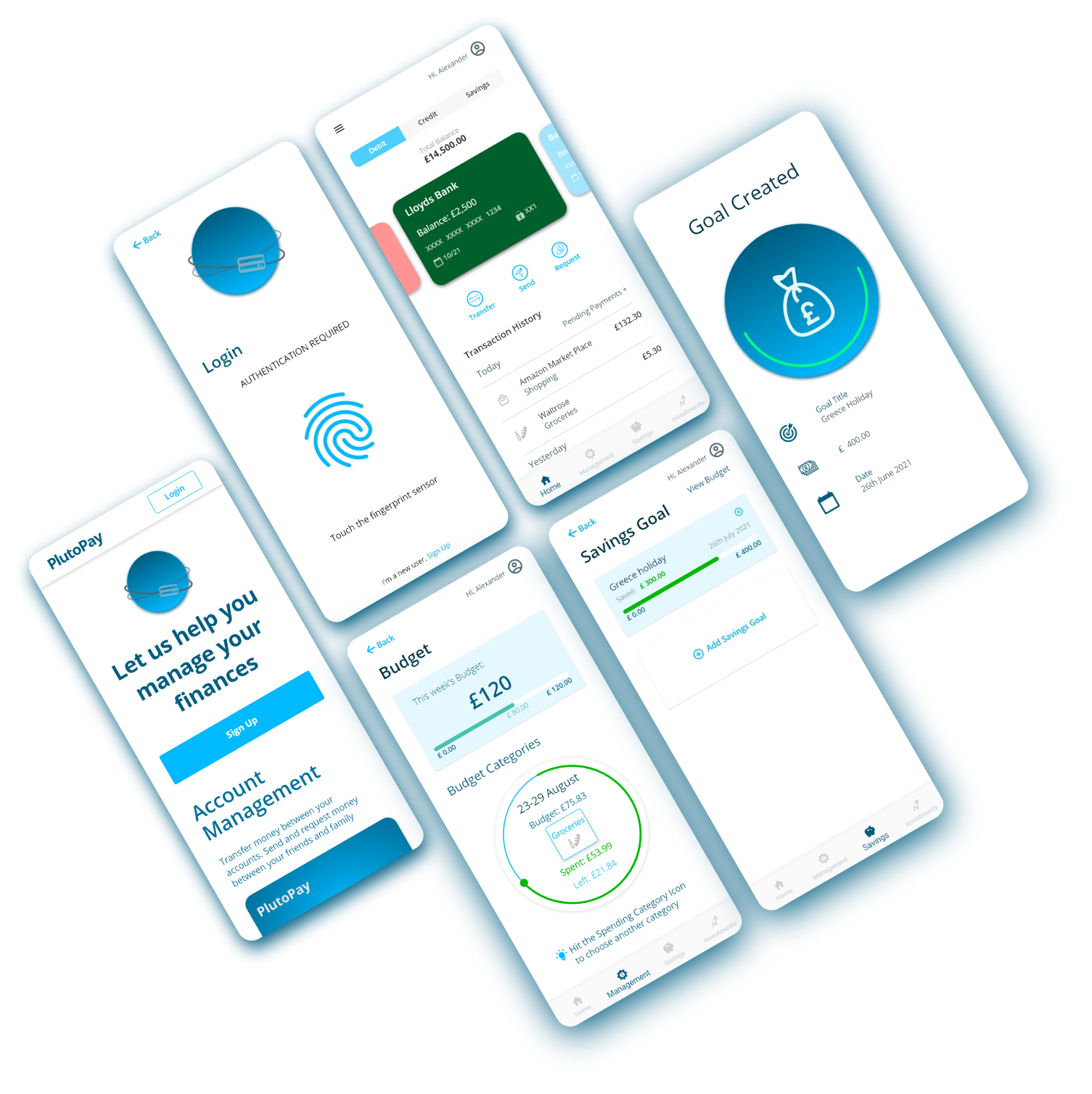
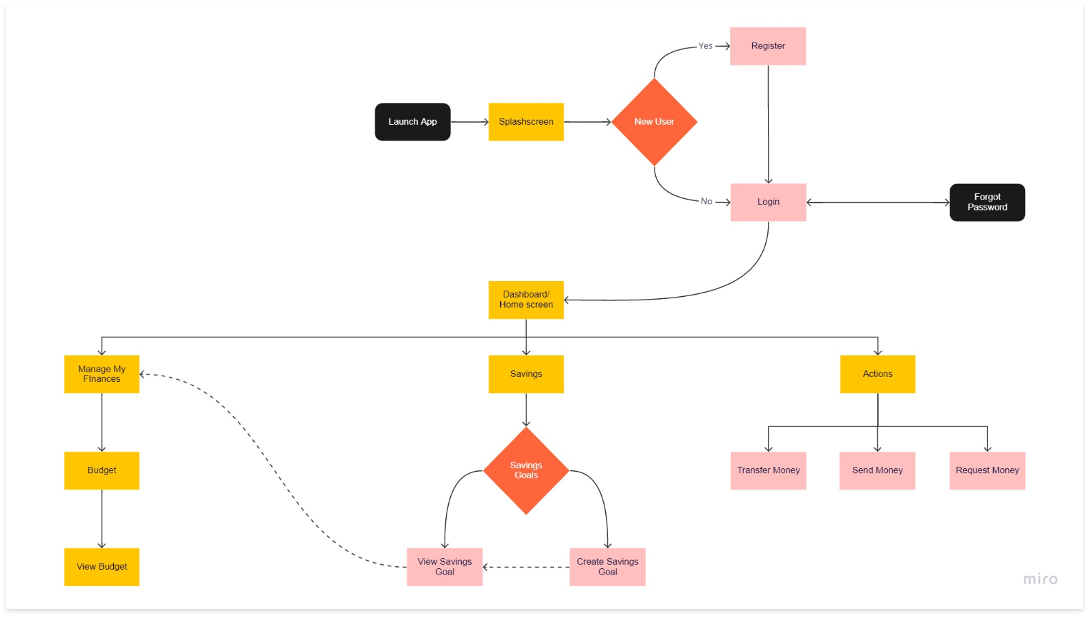
As a new fintech app user, I want to open an account with PlutoPay so that I can have a one stop place to manage all my bank accounts and financial transactions.
As a regular fintech user. I want to transfer money from my bank account to another account using the fintech mobile web app PlutoPay, so that I can easily manage my finances and pay my bills on time.
As someone who is . I would like to have an app that makes it easy to keep me uptodate with my spending and allow me to set financial goals, so that I can be more aware of my finances and save money.
I emphasised creating a streamlined user journey for effortless navigation. It should be smooth and simple to avoid overwhelming users, especially because financial services are already complex and can involve a large amount of information.
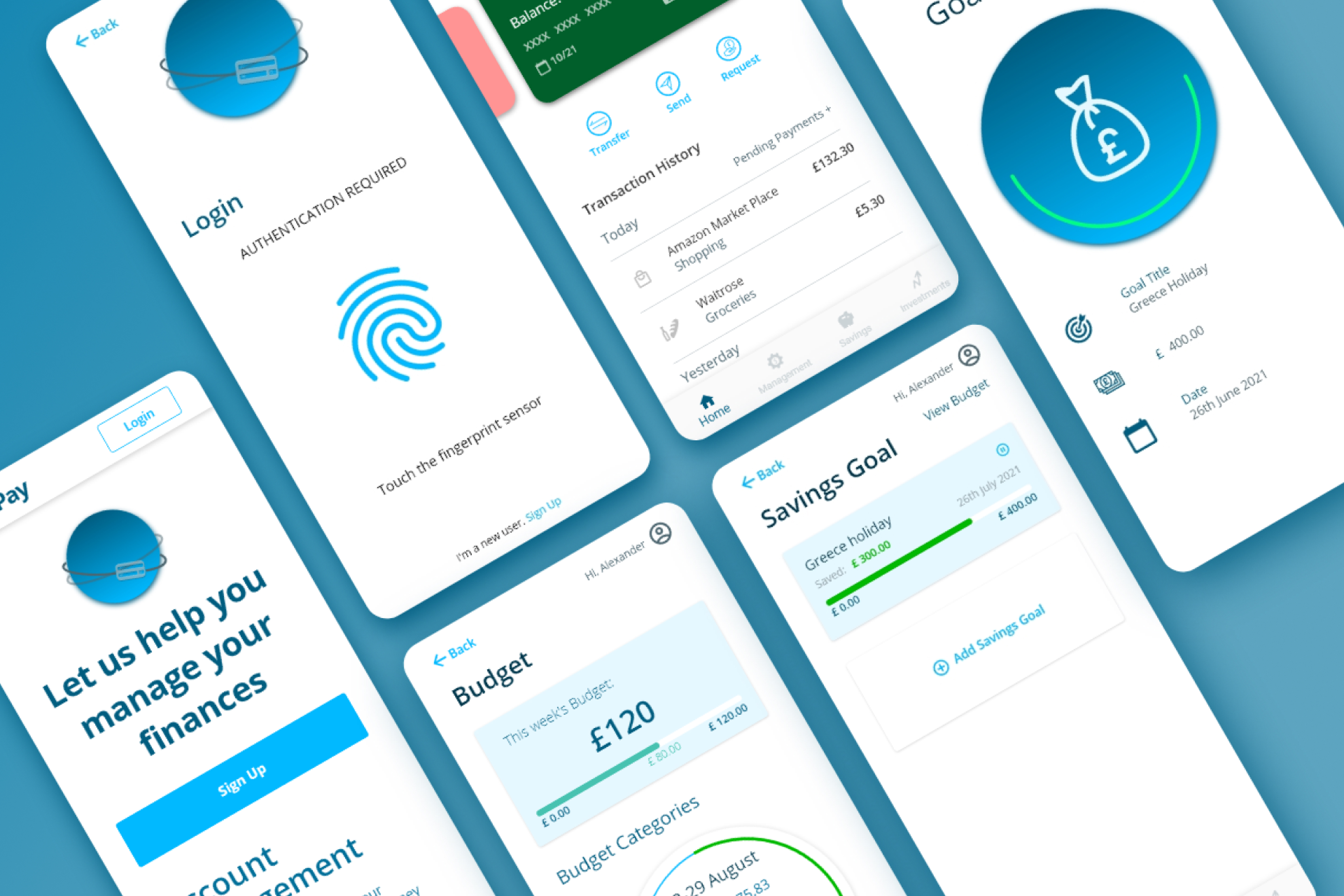
After developing these sketches I completed a quick round of user testing to see if the design made sense to users before using Adobe XD to develop the fidelity of my design. You'll see how the product develops over the next few stages, creating a clickable prototype.

Using Adobe XD I began building out more screens that followed my task flows. I added more details (page titles, input boxes, icons) and a more defined layout to each screen.

Assess the learnability of new users interacting with our app for the first time and identify areas of improvement and to assess users’ feelings while navigating through the app.

Measure how quickly participants are able to log in, as well as if there’s any hesitation to providing personal information.
Find out if participants can easily locate and send money to somebody.
Find out if participants can successfully create a savings goal and set up a budget.
With the clickable prototype created using Adobe XD, I conducted 6 moderated in-person usability tests. All tests were successfully completed, and following my test script was extremely helpful to guide me through the study and extract the information I initially planned to have. Below are the notes I took to create the affinity map and refine my designs based on higher-severity errors. The Rainbow Spreadsheet can be accessed here.
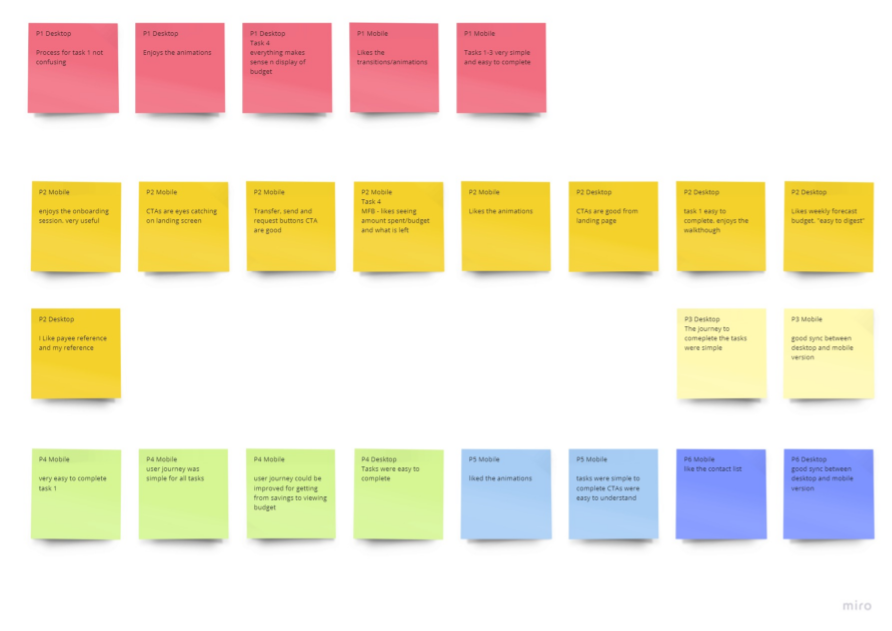
Users were confused on how to select the account they wish to transfer money to on the mobile version
High
Make the form field a lot easier to interact with and less cognitive load
Users struggled to select and find the appropriate account that they were tasked with transferring money to. By making it simpler Users should be able to complete the task more easily

Understanding Budget graphs and how their budget goals are displayed to Users. Particularly in the Mobile version
High
Change the graph from a daily to weekly budget break down
Users found it difficult to read the graph and also didn’t really know what the graph was trying to convey. By simplifying the graph Users are able to get a better and more instant understanding of their budget requirements.
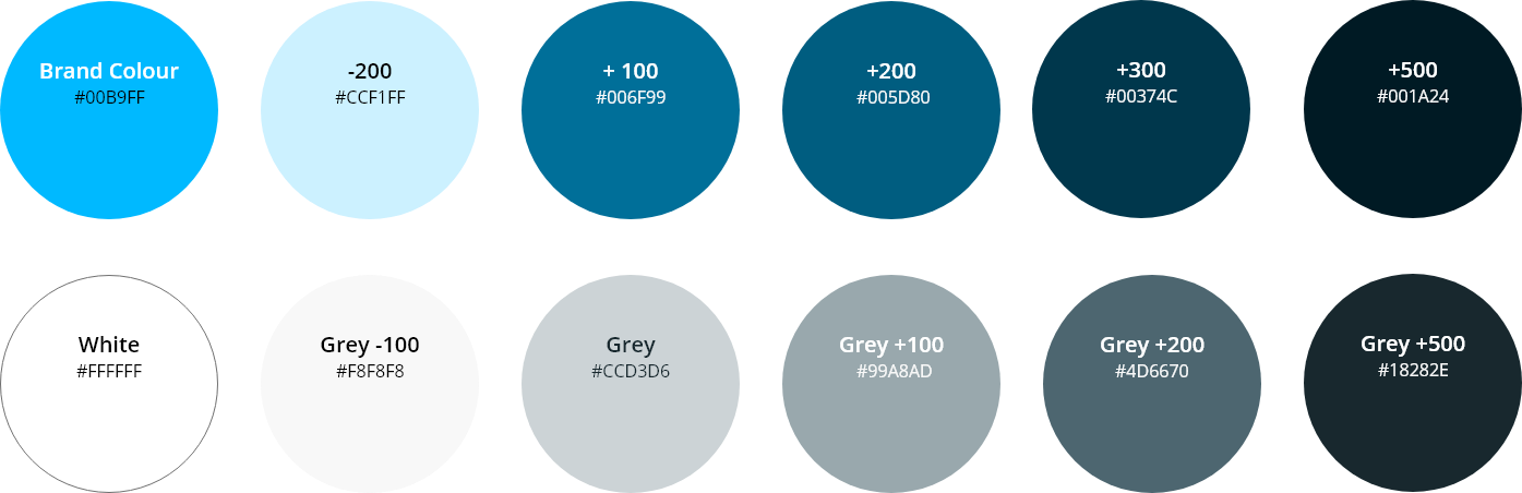
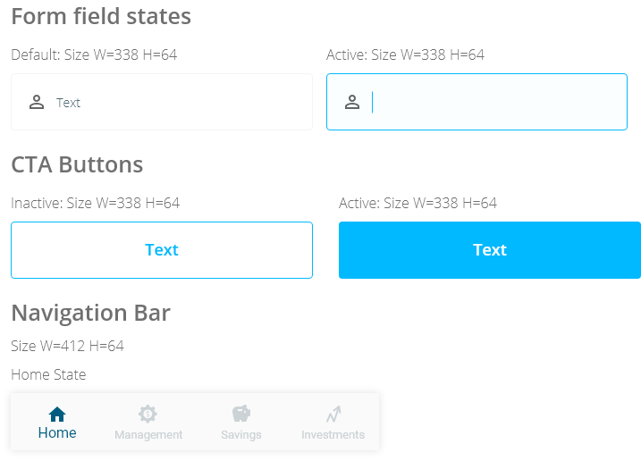
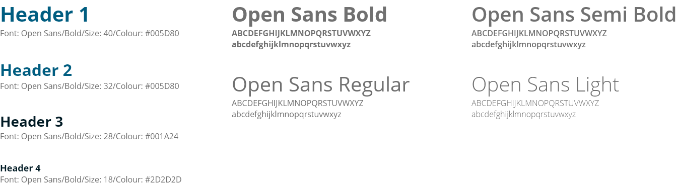
The goal here was to construct a central source of truth for PlutoPay's digital language.
What should the UI Design style be for a mobile banking app?
Create something that is visually stimulating but at the same time simple as data visualization is a priority for the user.
I have tried to first meet user’s base expectations and try to remove friction first. I will be using pleasant colours to invoke emotion. A crucial need of a bank is to be seen as trusting, loyal and consumer friendly.